
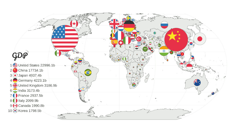
Scroll through any atlas of global statistics and you'll notice a pattern so predictable it's almost boring. GDP per capita? Check. Life expectancy? Check. Internet access, education, corruption? Check, check, check. The colors shift slightly, but the story stays the same: North America and Western Europe glow green, sub-Saharan Africa bleeds red. It's a visual shorthand for "developed" versus "developing," and we've been trained to accept it without question.
But here's the thing: maps are not neutral. They're interpretations. And when the same pattern shows up across dozens of unrelated metrics, it's worth asking whether we're looking at reality or at a reflection of the people who made the map.
The Choropleth Trap
Most global statistics maps are choropleth maps — those shaded polygons where darker or greener means "more" of something. According to data visualization researchers, choropleth maps are great for showing patterns like political party dominance, income levels, and pollution rates. But they also flatten complexity. A country of 1.4 billion people gets the same single shade as one with 1.4 million. And the choice of color scale, break points, and even which countries to include can dramatically change the story.
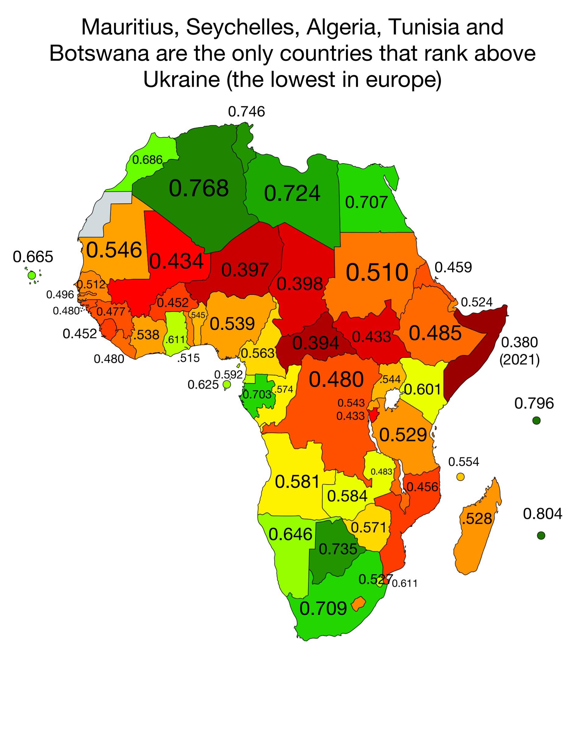
Take the Human Development Index, for instance. It combines income, education, and health into a single number. But that number is computed using data that's often missing, outdated, or collected under wildly different conditions. Sarah Battersby, a research scientist at Tableau, points out that maps can reveal patterns numbers alone cannot show. But she also warns that different map types tell slightly different stories about the same distribution. So when we see a map of Africa painted uniformly red, we need to ask: is that the whole story, or just the story this particular map is equipped to tell?
The Ranking Racket
International index rankings are seductive. They promise a clean, objective way to compare countries. But they're not. B. Høyland, in a paper titled "The tyranny of international index rankings" (cited 226 times, so it's not exactly obscure), argues that these rankings emphasize country differences where similarity is the dominant feature. In other words, the indices are designed to spread countries out along a scale, even when most countries are actually pretty similar. The result is a false sense of gaping disparity.
And who designs these indices? Mostly Western institutions. The World Bank, the UN, the IMF, various NGOs headquartered in London or Geneva or New York. They define what "stability" means, what "freedom" means, what "well-being" means. Those definitions carry assumptions that don't always travel well. A 2022 article in the Global Policy Journal put it bluntly: international benchmarking methods reflect politics, suffer from incomplete coverage, sample size and bias challenges. That's not a radical leftist critique; it's a methodological acknowledgment.
Consider this: many global indices rely on surveys that are conducted primarily in urban centers, in languages that not everyone speaks, and with questions that may not make sense outside a Western context. Then they extrapolate to entire countries. The result is a map that shows data availability as much as it shows the underlying phenomenon. Countries with weaker statistical systems get penalized simply for not having the infrastructure to produce clean data. It's a classic case of blaming the patient for not having a thermometer.
What If the Maps Are Lying?
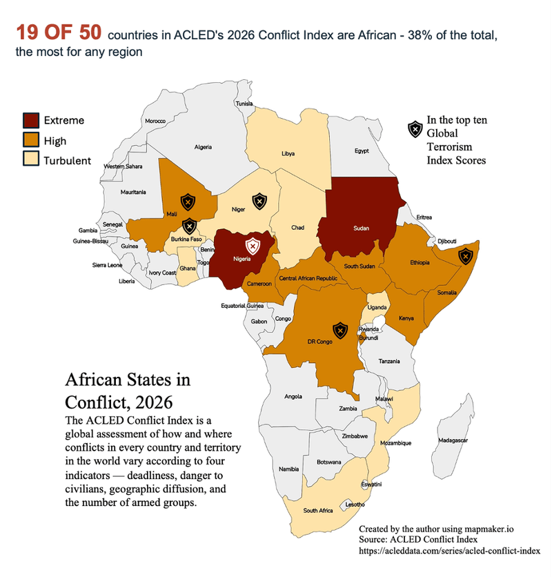
Now, I'm not saying every statistic about Africa is wrong. Far from it. There are real, measurable gaps in income, health, and education. But the way we present those gaps on a world map often exaggerates them and erases nuance. Take the "Tale of Two Africas" map that's been circulating: it shows that some parts of Africa are on par with middle-income countries, while others lag behind. But that map is rarely the one that goes viral. The viral one is the one that paints the whole continent red.
Maps have a unique ability to reveal unexpected patterns and spark meaningful conversations, says Ch Mubeen Khan, a data visualization enthusiast. But they can also reinforce stereotypes. When every global map shows the same red blob over Africa, it becomes hard to see the continent as anything other than a problem to be solved. That's bad data; it's bad storytelling with real consequences for policy and investment.
And it's Africa. Look at any map of "happiness" or "corruption" and you'll see similar patterns. The West is green, the Global South is red. It's a color-coded worldview that flatters the powerful and damns the poor, all under the guise of neutral data. But as any cartographer will tell you, there's no such thing as a neutral map.
Breaking the Pattern
So what do we do about it? First, we need to demand better data. That means investing in statistical capacity in countries that lack it, rather than just excluding them from rankings. It means being transparent about what's measured and what's missing. And it means using alternative visualization methods, like cartograms, that can show patterns like political party dominance, income levels, and pollution rates without relying on the same old color scales.
Second, we need to read maps critically. The next time you see a global map that looks suspiciously familiar, ask: who made this? What data did they use? What's the sample size? What definitions are they working with? Because the map is not the territory. It's a story someone chose to tell.
And maybe, just maybe, the most interesting story is not the one about how different we are, but how similar. Høyland's research suggests that most countries are actually pretty close on many measures. The rankings amplify tiny differences into huge chasms. That's a choice, not a fact.
So let's stop treating these maps as if they were handed down from on high. They're made by people, with all the biases and blind spots that entails. The pattern of green West and red Africa is not a law of nature. It's a habit. And habits can be broken.